A good game should sell itself. That’s probably something you’ve heard somewhere along the line – the idea that if your game is good enough, it’ll find an audience on its own.
And yes, in an ideal world, a good game SHOULD sell itself but as we all know, they often don’t. I regularly take a moment to think about the number of titles uploaded to Steam every day (an average of somewhere around 30 according to Steam Spy) and how many of those languish in obscurity because no one ever took the time to try them. It’s a great way to have a small existential crisis.
But why do players decide not to try a game? Well, lots of reasons. But the first and most obvious starts right at the beginning of the sales pipeline when players are browsing for games.
Let’s take Steam for example. If we take a trip through the browsing process, we can identify exactly where someone might first decide to disregard a game:
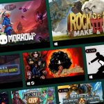
- We browse Steam
- We scroll down to “New Releases”
- We see the game’s capsule image.
And that’s it, right there. That’s make or break time. That singular 231 pixels wide by 87 pixels high image – the very first opportunity a user has to come across your game on a digital platform. That’s your first impression, your best chance to coax a person onto your page and check out what you’ve made.
It sounds very shallow, sure, but humans are visual creatures. If their interest isn’t piqued by your game, it’ll be piqued by the next, or the next. It’s why good branding is so important.
As an indie marketing agency, we see a wide range of branding experience, from entry-level all the way up to the professional designer realm. We’re proud to say that we’ve also helped developers and publishers rebrand their games in a multitude of effective ways. That’s why I feel perfectly qualified to call out some of the worst trends I’ve seen in video game branding, in the hopes that you too can avoid these pitfalls.
The following is a non-exhaustive list of branding mistakes that you can spot for yourself on many digital video game storefronts today. To avoid embarrassment, I have mocked them up for our favourite fictional game, and Game If You Are mascot – “Magic Capybara”.
The “I made this in MS Paint”

Look, I get it. Not everyone has a copy of Photoshop or Illustrator. Not everyone knows HOW to use Photoshop or Illustrator. That’s fine. But you can’t get by on MS Paint – no one can.
If Graphic Design simply isn’t your thing, it’s time to consider commissioning someone who knows their way around Photoshop, Illustrator and the rest. You wouldn’t let someone who doesn’t develop games work on your code, so why should someone who doesn’t do graphic design make your graphics?
The “Hey look, it’s that same font again”

There are a handful of fonts that are so well-worn that they’re practically ubiquitous. The font above, for example, is one of these. I see this type of blocky, grungy font EVERYWHERE.
When selecting a font for your branding, try to look for something which isn’t such well-trodden ground.
Fun fact: I used the above font, or a very similar one, both for the invites to my 18th birthday party and for the logo of my very short-lived college band. I’m still embarrassed about it.
The “Unedited typeface”

While we’re on the subject of fonts, I want to make it known that there is absolutely no shame in picking an off the shelf font (so long as you have permission or a license to use it) to use for your game’s logo.
Not everyone can design a whole font from scratch – in fact, a sizable chunk of graphic designers will go their entire careers without designing their own typeface, so picking an existing font to use for your logo is not just recommended, it’s encouraged!
But simply picking a font and typing out the name of your game does not make a logo. You need to consider positioning, sizing, placement and effects. These are the properties that turn a bunch of typed out letters into a logo.
The “Barely readable”

Look, I’ll level with you. I think metal band logos are cool as hell. But I’ll be damned if I can ever read what they say. If I even glance at a metal festival lineup poster, I get a nosebleed.
I’ve seen similar designs bleeding into the videogame space, and whilst games like Doom have done a great job of representing the metal aesthetic in games, logos like the example above do nothing for brand recognition or, more importantly, accessibility. When putting together branding for your game, it should be readable above all else.
Take the above. Sure, it looks pretty rad, but it definitely looks like it says Magic Ladybard doesn’t it? Enough said.
The “Cultural appropriation”

I have to admit – this is the one which grates me the most. In some cases, I’m sure that it’s done with genuine ignorance, but it’s 2021 and we should really all know better by now.
Please, please, PLEASE don’t use characters from other alphabets in place of the English alphabet. Not only is it essentially cultural appropriation, but it also renders the characters meaningless in this new context. It’s also a great way to alienate a chunk of your audience who might use that alphabet and who now think you’re a bit silly.
The “Blood Dragon”

Remember when Far Cry 3: Blood Dragon released, back in 2013, and how it subverted 80s action movie tropes in a really fresh and interesting way? And remember how great the branding looked, with its neon pink, giant orange sunset and Tron-style grid designs?
That style choice, as well as a few others from around that time, inspired a synth/vaporwave aesthetic that has been relentlessly aped for close to 8 years now – to the point where it’s practically a meme in 2021.
I’m not saying that it isn’t still a great vibe – it is! But the key to branding is in distinguishing yourself from everyone else, and this aesthetic is very played out at this point.
The “Minimalist”

I see this ALL the time. And by this, I’m referring to branding which features the name of the game and literally nothing else.
I understand the desire to maintain an air of mystery, but this is an industry where you have a fraction of a second to catch a potential player’s attention as they scroll down a storefront.
Your branding needs to work hard to explain what your game is, or at least give an idea of the general vibe, at a glance. White text on a black background just ain’t going to cut it.
The “Papyrus”

Look, just never, ever use Papyrus. Just trust us on this one.
—
Branding your game is never easy, especially so if you don’t have a background in graphic design. Although this highlights the more common missteps there are many, MANY more.
Your game’s branding is as important as the game itself, it’s the first thing players see when they engage with your product. This means you should be putting as much effort into getting it right as you do into development to ensure your game has the best chance of success on its chosen storefront.